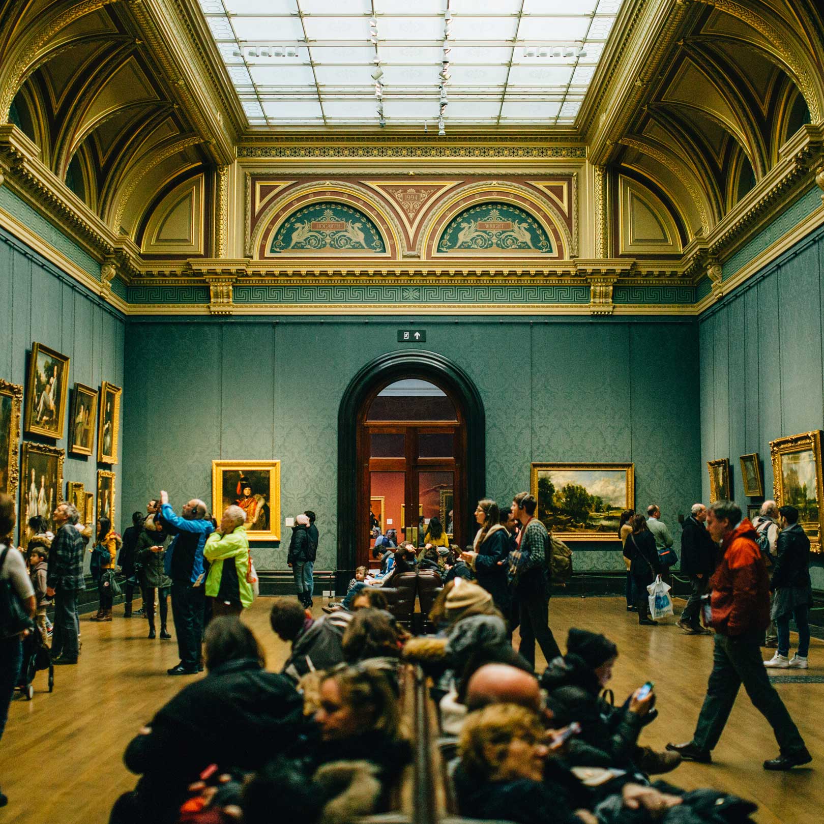
What can museum exhibit design teach us about UX design?
As soon as you step foot in a museum exhibit, you’re faced with dozens of decisions: Read the wall of text that greets you at the entrance or dive right in? Walk through the room clockwise or counter-clockwise? Examine the label on each piece or just soak in the visual elements and skip the little details?
So it should come as no surprise that museum-exhibit designers have been thinking about the user experience for hundreds of years. Whether you’re staring at a digital screen or a gallery wall, you’ll likely find yourself in the hands of a curator, a writer, and a visual designer, all teaming up to anticipate your every need—and the needs of thousands of visitors who may be nothing like you.
Beverly Serrell has spent the better part of 40 years trying to make that challenge a little easier. In her role as a museum consultant, she’s helped exhibit designers at the J. Paul Getty Museum, Monterey Bay Aquarium, Exploratorium, National Archives, and dozens more. She’s even written three books on the single topic of exhibit labels, so she knows a thing or two about “microcopy.” Here, she sheds some light on the challenges of designing a user experience in three dimensions.
You’ve written a lot of words about words. How does writing help frame a museum visit?
First off, research shows us that that if an exhibit begins with a wall of text containing several paragraphs, most people will read the shortest paragraph first, regardless of where it is in the layout. It’s not like when you’re sitting down in the comfort of your own home with good lighting and a cup of coffee, starting at the beginning of a book or an article, and working your way to the end.
Related: 10 UX copywriting tips for designers
Research also tells us that there’s some sort of magic in labels and in paragraphs that are no more than 50 words. As Stephen Bitgood has said, visitors are looking for the easiest thing that might be beneficial, and if it is beneficial, then you, as a designer, have taken them one step forward and given them a little more motivation to put forth even more effort.
“Most people will read the shortest paragraph first, regardless of where it is in the layout.”
Exhibit designers also have to remember that even the most diligent visitors aren’t stopping at every station and reading every label. As soon as visitors read a label that assumes they’ve read the one before, they end up confused and frustrated. So if you’re telling a story through the exhibit, you have to do it knowing that people may only experience 50 percent of the exhibit or less.
And last, many labels start with the background—where the artist was born, what significant thing happened—and it’s not until you get to the very end that this huge lightbulb goes off and the viewer thinks “Oh, this is what I’m supposed to see.”
Good exhibit writing actually flips the rules: Start with the specific and work to the general; start with the present and work to the past. Often that means literally and figuratively taking out the scissors, cutting out the last paragraph, and putting it at the top.
Photo by Riccado Bresciani
You’ve been working with museums for many decades now. What are some of the biggest lessons you’ve taken away in that time?
Whenever you’re crafting directions around an interactive experience or guiding people through a process, you’ve got to try it out with someone who represents your target audience—someone who knows nothing about it. Show it to the mailroom people or the front-desk staff or take a rough model directly to visitors. Cut out pieces of paper and paste them on the wall, and say, “We’re working on an exhibit and we want to try it out with the public beforehand so we can fix any problems and make it even better before we put more money into it.” People will give honest feedback because they know that what they say might have an effect.
“If people misread something or overlook some direction, you have to change it—you can’t blame them.”
I’ve learned over and over again that you can’t foresee how everything will work, so do your best job, put your best knowledge to bear, and then listen: People will misread certain words or read the text in an order you wouldn’t have expected—they’ll surprise you over and over again and help set you straight.
And if people misread something or overlook some direction, you have to change it—you can’t blame them. It’s amazing how people without a really deep love of their audience can be very demeaning: “Oh, those stupid visitors.” But if people walk into an exhibit and immediately think, “This is not meant for me—they have someone in mind who’s smarter than me, or who knows something I don’t know,” then you haven’t done your job.
What sorts of things do you learn from observing people as part of your consulting work?
Museum time is very expensive—a lot can happen in just three seconds. If you see people struggling or if you see them pressing a button and nothing’s happening, the first thing they think is “I’m not doing this correctly,” not “The designer didn’t make this intuitive enough,” so watching people struggle with something is a big clue, and so is watching people ignore something.
And if something is being ignored, how do you know how to fix it?
Usually it’s pretty easy to tell. If you’re looking at a floor plan that maps “hot spots” of visitor traffic you’ll see why popular exhibits are attractive—they’re in the sight line (and therefore hard to miss), they’re interactive; and often if some people are already using it, that will attract even more people.
For exhibits that are really “cold,” you’ll probably see that it’s not in the sight line, there’s something across the walkway competing for attention, it’s not well-lit, or it looks too daunting; it could even be in the flow of traffic, so people aren’t comfortable stopping in the middle of a crowd, even if it’s the best example of a beaded Indian craft in the entire exhibit.
Photo by Bara Cross
In much of your writing, you talk about “The Big Idea” that every exhibit should try to convey. What is that about and why do some exhibit designers seem to overlook it?
The Big Idea is the answer to the question, “What is this exhibit about?” Visitors generally walk through exhibits quickly and incompletely, so the Big Idea can’t appear just once in the introduction—it has to be a thread that weaves its way through the whole thing, giving people momentum, and moving them in the right direction.
The Big Idea is also an important tool to keep the writer, the curator, and the designer working together. What visitors learn at one “station” is going to resonate with something they learn at another one, so that as they move throughout the exhibit, it’s building that gestalt as opposed to presenting a totally independent idea one after another—because after 25 new ideas, you’re just ready to quit.
If, at the end of the exhibition, people can’t tell me what the museum was hoping to accomplish, and it’s clear that it didn’t really penetrate them or prompt any depth of thought or emotion, then the exhibit has failed. I’ll often ask open-ended questions like “What’s one new idea you’ve taken away today?” or “Finish the statement: I didn’t know…. or The exhibit reminded me of….”
Sometimes I’ll get answers that are moving and even spiritual: “The exhibit reminded me I really need to do something I’ve been putting off” or “It reminds me of God and nature….”
Those emotional sort of responses show that you’ve made a real connection.
Source:www.invisionapp.com


